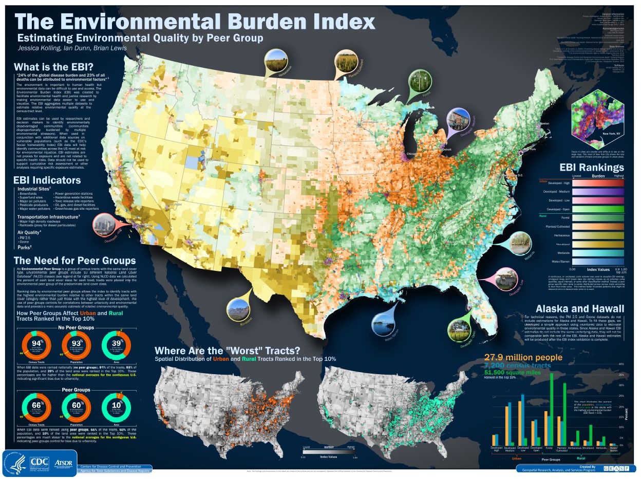
Mapping Injury, Overdose, and Violence Dashboard
More Americans ages 1-44 die from injuries and violence—including overdose, suicide, or homicide—than any other cause. In order to help understand the problem, inform prevention, and save lives, the CDC just released the first ever look into local level deaths from injury and violence, including those related to firearms.
The Dashboard
This interactive dashboard developed by the National Center for Injury Prevention and Control (NCICP) as the Centers for Disease Control and Prevention (CDC) displays data on deaths from drug overdose, suicide, and homicide. The dashboard shows information down to aggregated census tracts using provisional and final death data received from states. This dashboard also displays firearm deaths from all causes, homicides, and suicides which is a first as far as I can tell.
Click on the map below or here to visit the dashboard.

Neighborhood Data
This neighborhood view is made possible by geocoding the person’s address from their death certificate and then joining that address to a census tract. Census tracts are then combined with neighboring census tracts until they reach a population of 10,000 people. The CDC only started recently geocoding these data and the geocoding only goes back to 2022.

In addition to this geographic aggregation, small numbers are also modeled using a Bayesian model. Also, the dashboard uses Vector Tiles to effectively display large quantities of small geographies (aggregated census tracts) at the national level.
Unique Patterns
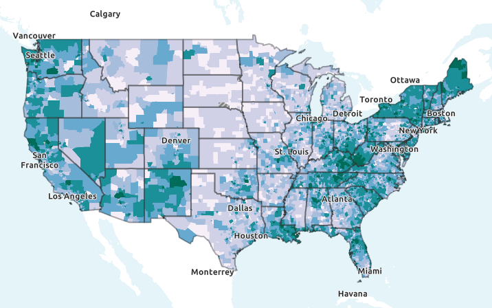
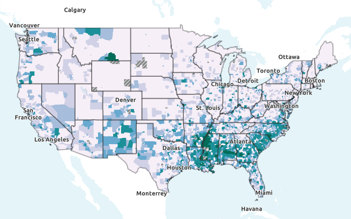
The unique combination of geographic aggregation, Bayesian modeling, and Vector Tiles helps local health departments and communities better understand where the problems related to overdose and firearms are most severe. It also lets users see broad national and regional trends in the data such as higher drug overdose deaths in Appalachia and higher firearm suicides along the Mississippi and throughout the Deep South.
Use the slider below to slide between Drug Overdoses and Firearm Homicides at the neighborhood level to see the variation in the patterns across the country.
Look through the links below to read more about the dashboard.